The truth shall set you free, but first it's going to piss you off
Bemusements
Mail me!
enthalpyd (at) yahoo (dot) com


Fark.com
Lileks
Dave Barry
theonion.com
The Sneeze
5ives
Don't Even Reply
Banterist
The Joe Bob Report
News
Amarillo Globe-News
League City
Houston Chronicle Metro
Yahoo most popular
BBC World
Telegraph
Times of India
Congress
Houston TranStar
Commentary
The Agitator
Althouse
Overlawyered
Arts & Letters Daily
InstaPundit.com
Blogroll
bibliosquirrel
The Dullard Gazette
Tasha
Space4Commerce
Dave & Mel
rook's rant
NASA
NASA Watch
Spaceflight Now
NASA Human Spaceflight
What's this?
Sand!
words
Infinite Cat
Post Secret
Beer
SudsPundit
Real Beer
1,000 Bars
Pictures
Big Picture
In Focus
Shorpy
Found Photos
Awkward Family Photos
Sexy-People
Sorry I Missed Your Party
There, I fixed it
moon phases |

Archives
04/01/2002 - 05/01/2002
07/01/2002 - 08/01/2002
08/01/2002 - 09/01/2002
09/01/2002 - 10/01/2002
10/01/2002 - 11/01/2002
11/01/2002 - 12/01/2002
01/01/2003 - 02/01/2003
02/01/2003 - 03/01/2003
03/01/2003 - 04/01/2003
04/01/2003 - 05/01/2003
05/01/2003 - 06/01/2003
06/01/2003 - 07/01/2003
07/01/2003 - 08/01/2003
08/01/2003 - 09/01/2003
09/01/2003 - 10/01/2003
10/01/2003 - 11/01/2003
11/01/2003 - 12/01/2003
12/01/2003 - 01/01/2004
01/01/2004 - 02/01/2004
02/01/2004 - 03/01/2004
03/01/2004 - 04/01/2004
04/01/2004 - 05/01/2004
05/01/2004 - 06/01/2004
06/01/2004 - 07/01/2004
07/01/2004 - 08/01/2004
08/01/2004 - 09/01/2004
09/01/2004 - 10/01/2004
10/01/2004 - 11/01/2004
11/01/2004 - 12/01/2004
12/01/2004 - 01/01/2005
01/01/2005 - 02/01/2005
02/01/2005 - 03/01/2005
03/01/2005 - 04/01/2005
04/01/2005 - 05/01/2005
05/01/2005 - 06/01/2005
06/01/2005 - 07/01/2005
07/01/2005 - 08/01/2005
08/01/2005 - 09/01/2005
09/01/2005 - 10/01/2005
10/01/2005 - 11/01/2005
11/01/2005 - 12/01/2005
12/01/2005 - 01/01/2006
01/01/2006 - 02/01/2006
02/01/2006 - 03/01/2006
03/01/2006 - 04/01/2006
04/01/2006 - 05/01/2006
05/01/2006 - 06/01/2006
06/01/2006 - 07/01/2006
07/01/2006 - 08/01/2006
08/01/2006 - 09/01/2006
09/01/2006 - 10/01/2006
10/01/2006 - 11/01/2006
11/01/2006 - 12/01/2006
12/01/2006 - 01/01/2007
01/01/2007 - 02/01/2007
02/01/2007 - 03/01/2007
03/01/2007 - 04/01/2007
04/01/2007 - 05/01/2007
05/01/2007 - 06/01/2007
06/01/2007 - 07/01/2007
07/01/2007 - 08/01/2007
08/01/2007 - 09/01/2007
09/01/2007 - 10/01/2007
10/01/2007 - 11/01/2007
11/01/2007 - 12/01/2007
12/01/2007 - 01/01/2008
01/01/2008 - 02/01/2008
02/01/2008 - 03/01/2008
03/01/2008 - 04/01/2008
04/01/2008 - 05/01/2008
05/01/2008 - 06/01/2008
06/01/2008 - 07/01/2008
07/01/2008 - 08/01/2008
08/01/2008 - 09/01/2008
09/01/2008 - 10/01/2008
10/01/2008 - 11/01/2008
11/01/2008 - 12/01/2008
12/01/2008 - 01/01/2009
01/01/2009 - 02/01/2009
02/01/2009 - 03/01/2009
03/01/2009 - 04/01/2009
04/01/2009 - 05/01/2009
05/01/2009 - 06/01/2009
06/01/2009 - 07/01/2009
07/01/2009 - 08/01/2009
08/01/2009 - 09/01/2009
09/01/2009 - 10/01/2009
10/01/2009 - 11/01/2009
11/01/2009 - 12/01/2009
12/01/2009 - 01/01/2010
01/01/2010 - 02/01/2010
02/01/2010 - 03/01/2010
03/01/2010 - 04/01/2010
04/01/2010 - 05/01/2010
05/01/2010 - 06/01/2010
06/01/2010 - 07/01/2010
07/01/2010 - 08/01/2010
08/01/2010 - 09/01/2010
09/01/2010 - 10/01/2010
10/01/2010 - 11/01/2010
11/01/2010 - 12/01/2010
12/01/2010 - 01/01/2011
01/01/2011 - 02/01/2011
02/01/2011 - 03/01/2011
03/01/2011 - 04/01/2011
04/01/2011 - 05/01/2011
05/01/2011 - 06/01/2011
06/01/2011 - 07/01/2011
07/01/2011 - 08/01/2011
08/01/2011 - 09/01/2011
09/01/2011 - 10/01/2011
10/01/2011 - 11/01/2011
11/01/2011 - 12/01/2011
12/01/2011 - 01/01/2012
01/01/2012 - 02/01/2012
02/01/2012 - 03/01/2012
03/01/2012 - 04/01/2012
04/01/2012 - 05/01/2012
05/01/2012 - 06/01/2012
06/01/2012 - 07/01/2012
07/01/2012 - 08/01/2012
08/01/2012 - 09/01/2012
09/01/2012 - 10/01/2012
11/01/2012 - 12/01/2012
12/01/2012 - 01/01/2013
03/01/2013 - 04/01/2013
04/01/2013 - 05/01/2013
02/01/2014 - 03/01/2014
Thursday, September 30, 2004
Posted
9/30/2004 05:58:00 PM
by Douglas
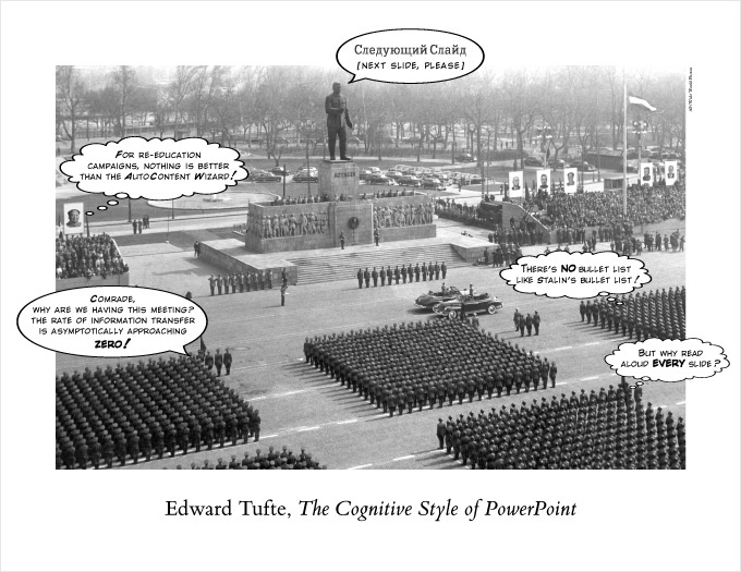
In corporate and government bureaucracies, the standard method for making a presentation is to talk about a list of points organized onto slides projected up on the wall. For many years, overhead projectors lit up transparencies, and slide projectors showed high-resolution 35mm slides. Now "slideware" computer programs for presentations are nearly everywhere. Early in the 21st century, several hundred million copies of Microsoft PowerPoint were turning out trillions of slides each year.
Alas, slideware often reduces the analytical quality of presentations. In particular, the popular PowerPoint templates (ready-made designs) usually weaken verbal and spatial reasoning, and almost always corrupt statistical analysis. What is the problem with PowerPoint? And how can we improve our presentations?

That would just be priceless on my office wall.


